Beats Fest
Brand Identity & Style Guide — Logo, Typography & Color System


Overview
Despite the name, BeatsFest isn’t a festival — it’s a fictional, cloud-operated music streaming platform built for a young, global, and diverse audience. The brief called for a full brand identity: not just a logo, but the complete system behind it — brand vision and voice, audience and competitor research, logo usage rules, typography, and a color palette — all assembled into a single style guide over four weeks in Illustrator and InDesign.
Brand Foundation
BeatsFest is framed as a platform founded by a collective of young software engineers, built on an inclusive, authentic, and progressive culture — delivering a fresh audio experience to an active, global youth audience. That translates into a specific personality: vibrant, hip, digital, inclusive, and avant-garde. Informal without being sloppy, it speaks to its audience as a culturally aware peer rather than a corporate platform.
Audience & Competitors
The target audience is overwhelmingly Gen Z (ages 10–25) and young Millennials under 30 — tech-proficient students, single young adults, and early-career workers who want simple, uncluttered interfaces, modern sans-serif type, and saturated color that holds up on dark-mode phone screens. Existing music platforms lean toward safe corporate greens, standard blues, or stark monochrome, paired with rigid geometric sans-serifs and a sterile tone. BeatsFest deliberately breaks from that: a fluid, app-ready logo built on a rhythmic sound-wave motif, in a vibrant color pairing, meant to feel current rather than corporate.
The Logo
The mark does double duty: read one way, it’s an abstract “BF” monogram; read another, it’s a sound-wave or audio-equalizer visualization built from rounded, pill-shaped bars and dots at varying heights. That dual reading — letterform and waveform at once — is the idea the entire visual system is built around. The “Beats Fest” wordmark sits underneath in a rounded, friendly display face. It ships in two official colorways: full color (Amazonite Green mark, Blue Oasis wordmark) for primary use, and charcoal monochrome for restricted-color contexts.
Logo Usage Rules
Rules
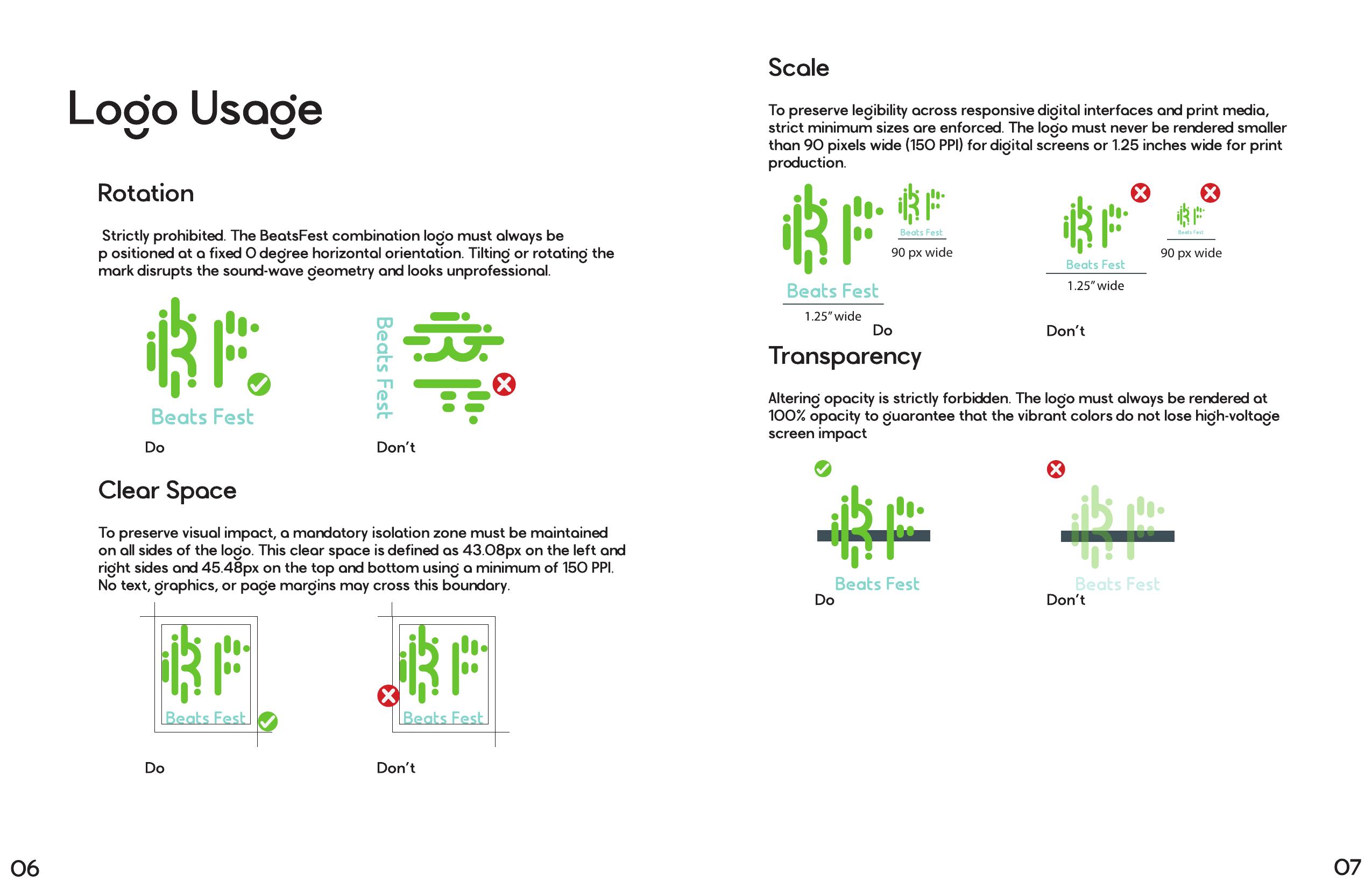
- No rotation — the logo stays fixed at 0°, since tilting it disrupts the sound-wave geometry
- Mandatory clear space (43.08px left/right, 45.48px top/bottom at a 150 PPI minimum) keeps text, graphics, and page margins out of the logo’s isolation zone
- Minimum scale is 90px wide (150 PPI) for digital and 1.25 inches wide for print, so the mark never renders too small to read
- Opacity stays at 100% — altering transparency is off-limits, to protect the colors’ “high-voltage” impact on screen
Typography
The whole system runs on a single typeface, Legian, varied by size and weight rather than paired with a second font. Accessibility is written directly into the type rules: every choice has to prioritize clean, open glyphs that stay legible at small sizes, and decorative scripts or ultra-fine serifs are ruled out entirely, since they blur on high-density mobile displays and fail low-vision users.
Color Palette
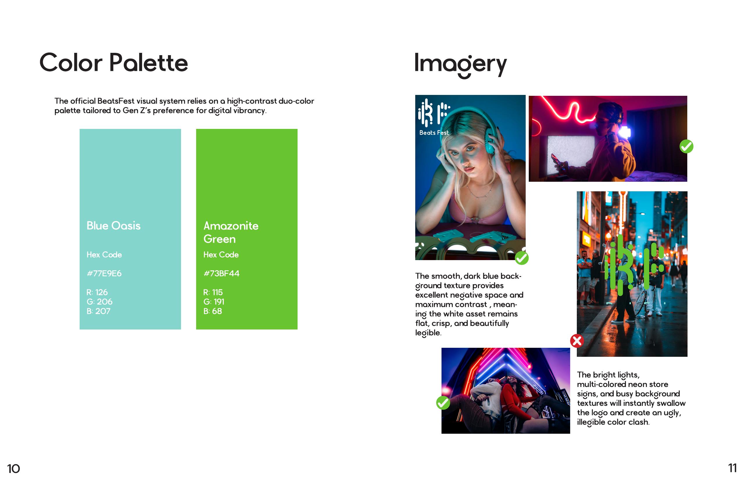
The palette is a deliberately small, high-contrast duo-color system, chosen for Gen Z’s preference for digital vibrancy over a larger, more conservative corporate range.
Imagery Guidelines
Approved photography leans on smooth, dark backgrounds — deep blues and moody night scenes — which give the logo maximum negative space and contrast, so the light-colored mark stays crisp. The guide is just as clear about what doesn’t work: busy, multi-colored neon signage and cluttered textures swallow the logo and create a clashing, illegible result, so those settings are a hard no even though they share the same general mood.
Next round
- Build out real mockups of the brand in use — app UI, playlist covers, and social templates
- Revisit the guide’s own layout so its pacing matches the brand’s energy rather than reading as a plain spec sheet
Reflection
The strongest part of this project is the thinking underneath the mark — a logo that doubles as both a monogram and a sound-wave visualization gives the brand system a reason to exist beyond “looks nice.” The guide is thorough on foundation, rules, and rationale: audience research, competitor positioning, exact usage specs, and accessibility built into the type choices rather than bolted on after. What’s still ahead is applying all of it in the real world, and giving the guide itself a layout as vibrant as the brand it describes.